Here’s the unvarnished truth about your home…
No one feels as sentimental about it as you do. That rickety, hand-carved pine chest of drawers your father made for you when you were a kid? The charming afghan in psychedelic colors so lovingly knit by Aunt Sally in 1965? You may find them beautiful, but they likely don’t have appeal to potential buyers who view your home online or in person. And in today’s market, your home needs to capture attention--immediate attention--if you hope to make a sale.
Research tells us that people spend less than 10 seconds evaluating a photo of a home online before deciding if they want to see more or skip to another home. The same is true of people who attend open houses: they love it or hate it immediately, and if they don’t love it, they lose interest and move on.
What can you do to increase the likelihood that your home will positively impress buyers in those first 10 seconds? Today’s buyers want to see contemporary white spaces with clean, modern lines and lots of light. If you don’t have that home, we can help you.
Here are four tips to help you create a clean, contemporary look:
1. Bare windows are better than old curtains. One of the most effective strategies to give a new, modern look to a room is to take down dated window treatments like these heavy, dark drapes mounted under a valance. Instead opt for clean, clear, naked windows. If you must have curtains, make them light, sheer, and airy. (We also removed the oversized antique rug, which made the space look smaller.)
In the after photo you can see how these minor changes open up the space, let in the light, and bring the room into the present.
Bright bare windows make this dining room fresh.
2. Sisal rugs say “modern.” We don’t favor wall-to-wall carpet. Here we swapped it out for a sisal area rug, tying the space together and giving it a contemporary feel.
A light-colored sisal rug and white features brightens dark paneling in this older home.
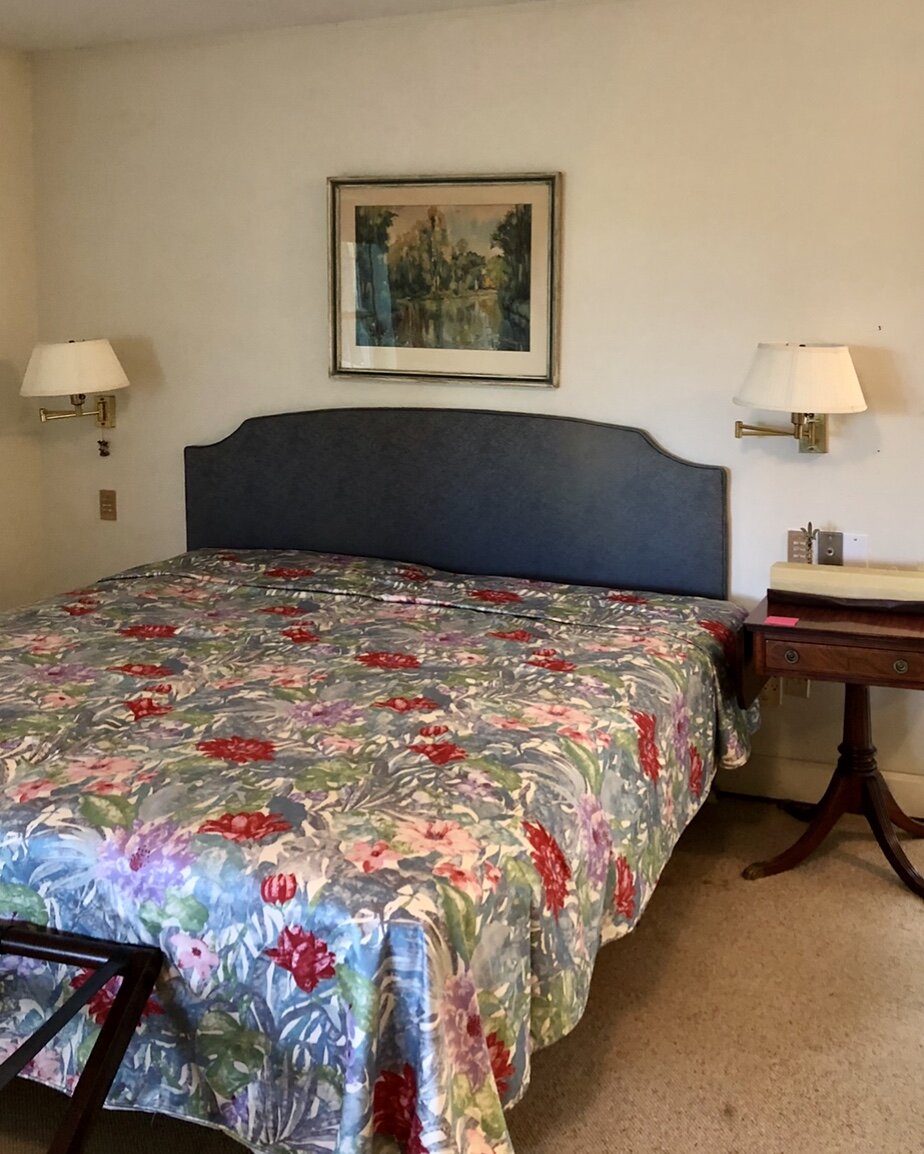
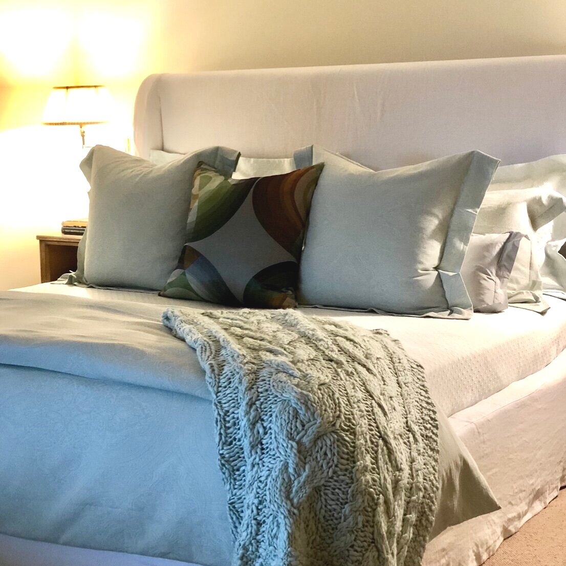
3) Make the master bedroom look like a five-star hotel. Yesterday’s beds were utilitarian; todays are luxe and indulgent. So lose the faded bedspreads and acrylic blankets. Instead, dress the bed with crisp white cotton sheets, ironed and unwrinkled, lots of throw pillows in varying sizes and/or shapes in complementing neutral tones, and a duvet cover in a similar neutral color. Think shades of grey, grey-blue, grey-green, and taupe, as in this room. A beautiful throw, in a complementing neutral tone, completes the picture.
The rest of the room should look just as cool and collected as the bed. To get that look, remove visual clutter and strive for a neat, clean, curated look.
Bye-bye to acrylic bedspreads and hello to bright and light linens.
4. When it comes to room color, favor white instead of bold colors. Although it’s possible to create a modern look with bright colors, it usually takes a professional to pull it off. Colors read differently depending on how big an area you’re covering, what color it’s surrounded by, and the kind and intensity of the light in the room, among other factors.
The blue walls in this room overwhelmed the space. The addition of the lighter blue sofa and blue table to the deep blue of the walls did not help. They were big empty slabs of competing colors--blue on the walls, brown on the floor, white on the ceiling--that weren’t speaking to each other. While we love blue, the space needed to feel open and unified.
The room was repainted white but kept a similar deep blue as an accent color. In addition to the striking blue in the artwork, we used varying shades of blue in the sofa and rug. They all work together to form a pleasing visual unity.
Deep blue accent colors instead of deep blue walls.
Want a bonus modernizing trick? Cluster candlesticks. Instead of the traditional linear placement of 2 to 4 candlesticks down the middle of the table, cluster multiple candles (here we used all silver candle sticks). This looks fresh and eclectic.
Don’t want to do it yourself? We understand. Want to learn more about how we stage homes to sell fast? Remote consultations available. Click the button below to learn more about our services.


