If you’ve caught a few of our Staged Ryte blog posts, you know our number one rule for effective staging: Tell a compelling story about the home that invites the potential buyer to see themselves living there. Whether the home is a mountain retreat in the snow, a 100-year-old Victorian in town, an architect-designed modernist masterpiece or a city apartment, the details of the story change but the questions that drive the main plot are the same: Will you be happy in this home? Will it be cozy and warm and intimate? Will you have a good life here? And like any good story, a staged-home story has chapters and subplots that carefully embellish the points of the main narrative. Bookshelves are in this category and that’s what we want to talk about here. We want to tell you how to decorate a bookshelf with books and other accessories.
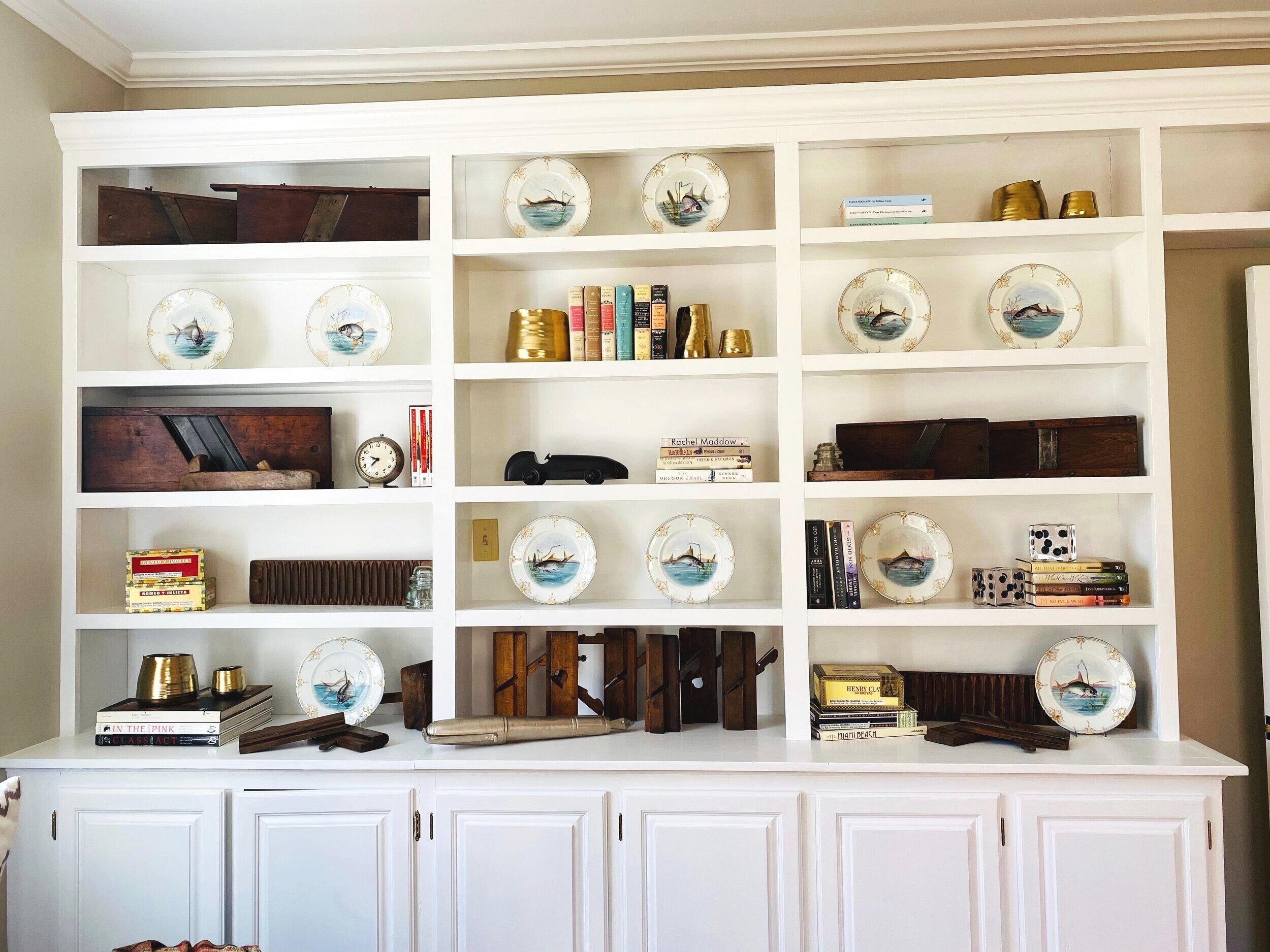
Recent bookshelf staging at a Great Barrington home. A big bookshelf often needs big elements in it to interest the eye.
Because bookshelves can be large and imposing visual elements, they deserve special treatment in staging. Skillfully staged bookshelves add layers of nuance to the staging, subtly reinforcing the image we want to create and the emotions we want potential buyers to feel.
We won’t lie: staging bookshelves is a big job. Here are a few rules for decorating shelves because we want you to know how to style a bookcase like a pro.
Start bare. Clear the shelves of everything on them. Remember, you’re writing a story here, and you wouldn’t start a new chapter of your book on a page that already had text on it, right? We wouldn’t either. So don’t try to stage the shelves with the stuff that’s already on them. Rewrite their story by emptying them and starting fresh.
Edit, edit, edit. Put everything you’ve removed from the bookshelves on a table so you can assess the items to see if a theme emerges. For example, in one house we staged, we focused on blue and white Limoges china plates with fish on them. Since the house was on a river, it made sense to use the fishplates as the foundation of a water-related theme. (See photo above.) After you inspect the items and you’ve got a theme, store or discard everything you don’t intend to use on the bookshelves. Feel free to dig deeper in your home - look at other bookshelves, closets, china cabinet, etc.. Those places may hold the key to your theme if you have not found it already. Move things around, maybe you have a few themes that can go in to multiple rooms or bookshelves.
Want to see a quick video from HGTV with three examples for decorating bookshelves? Click here.
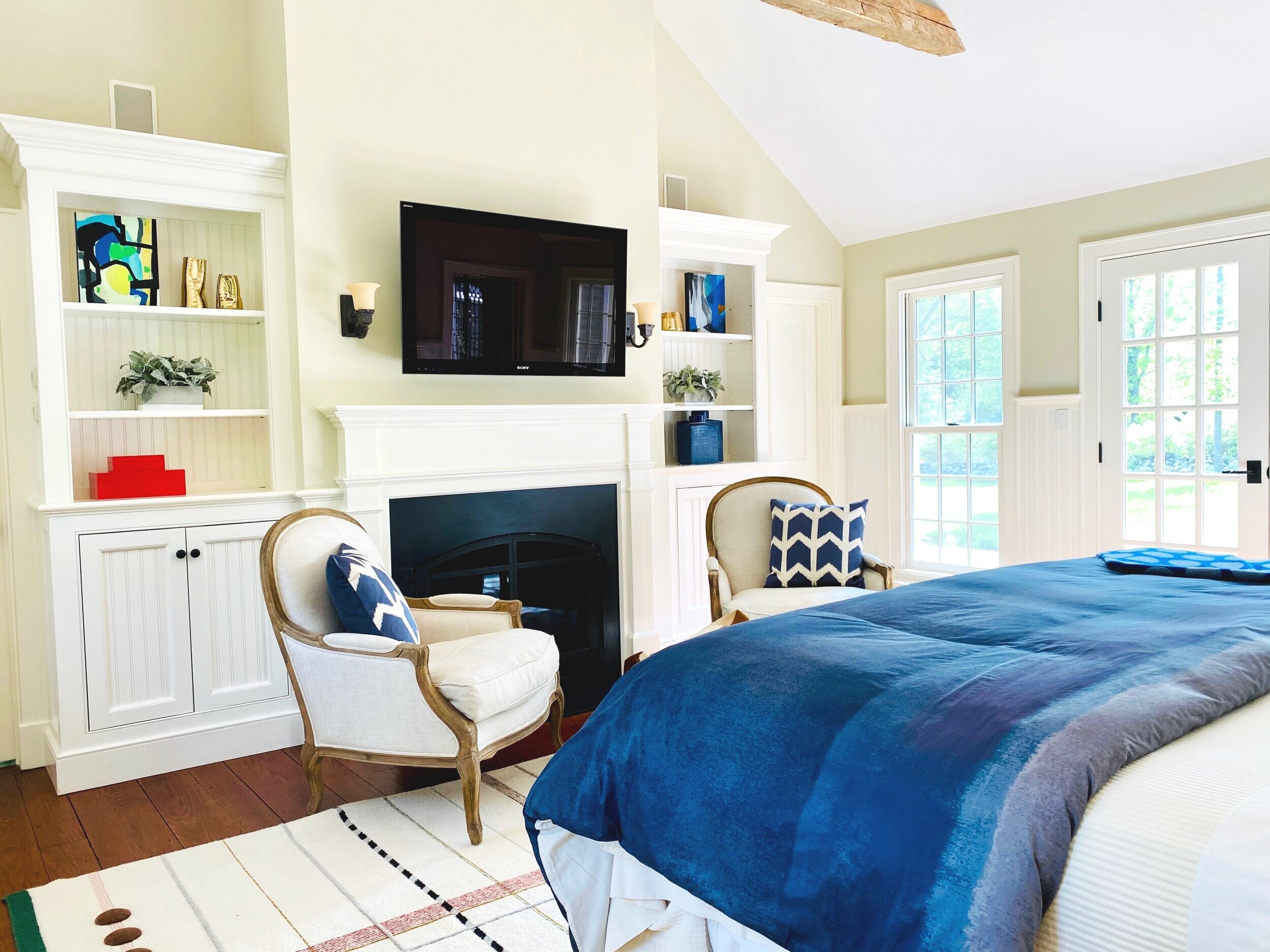
If a theme doesn’t emerge, create one. A theme could be a unifying color or palette, as in this photo (see photo) of a pair of white bead board bookshelves. Blue is the dominant color of one bookcase, as seen in the oil painting in deep azure hues, as well as the two square ceramic containers in a similar shade of cobalt. Those blues are also speaking to the blue bedspread and pillows, unifying the entire room. Even the second bookcase in this pair, which is deliberately not matchy-matchy, still echoes the color theme through the painting on the top shelf, which has two significant splashes of blue.
A theme will instantly give logic and cohesion to the space. These metal shelves came to life (see photo) with a collection of charming birds. While the birds are of different colors, sizes and shapes, they have a pleasing, unifying effect on the space.
Beautifully staged bookshelves have come into the limelight during this COVID-19 pandemic: they can be a fantastic backdrop for Zoom meetings as a status symbol or brand amplifier. This article showcases more examples of amazing bookshelf design.
What about the books? Unfortunately, for staging purposes, less is more where the books are concerned. We know it’s difficult for die-hard bibliophiles to hear, but when it comes to staging, books are simply another design element. Yards of bookcases tend to suck up all the light in a room and appear heavy and dark. So don’t fill the bookshelves with books only! Instead, leave space for other objects. Then go ahead and group books: according to their color; lay them on their sides; even with spines facing in and the pages facing out, to achieve a uniform beige/white look. (It’s almost impossible to find a book in such an arrangement. But they do look great.)
Introduce varied textures, finishes, and heights. A straw basket is an excellent counterpoint to a shiny metal object. A tall vase (or several) can work next to a squat flower pot. Plants literally bring life to any object they’re near. A mix of textures gives depth, richness, and nuance to the story of the home. And that depth works to increase the buyer’s attachment to the home, which in the best case scenario leads to a sale.
Bonus Pro Tip: Have lots of shelf space and not a lot to put on those shelves? Or do you have plenty of books taking up too much visual space? Hang a large piece of art on the bookshelf itself. It visually breaks up the space and adds interest.
Are you on Facebook or Instagram? Restage YOUR bookshelf and tag us when you post! @stagedryte #stagedryte (Use #shelfie.) <-- Want to know what a "shelfie" is?
If you decide you need professional shelf help, reach out to us! We stage homes, of course, and offer interior design services to homeowners. Contact dawn@stagedryte.com or call 917.543.4590 for an appointment.


